

Better UX
for AltspaceVR
Helping new users have more fun in AltspaceVR’s world.
Sponsored
Project
Rapidly improving technology is growing VR worlds at a rapid pace.
How might the onboarding and tutorial spaces be improved for novice users?

Project Overview
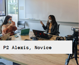
Our team designed and facilitated a series of 60 minute usability studies of the onboarding and tutorial process in AltspaceVR with a Samsung HMD Odyssey VR headset. These tests were conducted with sponsorship from Microsoft, AltspaceVR's corporate parent.
Project Skills
UX Research, UX Writing
Facilitation, Wireframing
My Role
UX Researcher and Facilitator
Team
Lo Cianflone, Leah Shin, Warisha Soomro
Toolkit
Miro, Figma, Sheets
Study Objective
The goals of usability testing included establishing a baseline of user performance, establishing and validating user performance measures, and identifying potential design concerns to be addressed in order to improve the efficiency, productivity, and end-user satisfaction onboarding and executing in AltspaceVR.
In particular, the objective of this study was to identify whether AltspaceVR’s visual design, interaction design, and technical communication is inviting and clear to new users and identify any barriers to entry. This was laid out in the following research questions:
-
What obstacles prevent users from completing the installation and setup of AltspaceVR?
-
Does the flow of the onboarding process reflect how the user thinks of the workflow? Are there noticeable differences between experienced and novice users?
-
How easily and successfully can users navigate between hub spaces? Within hub spaces?
-
Is there an appropriate balance of ease of use and ease of learning for novice users?
-
How well do users understand the symbols and icons used in the menus?

Study Objective
Methodology
What happened during the usability test
During each 60-minute test, participants
-
Completed a background questionnaire
-
Performed scenarios on the platform using the think-aloud method
-
Answered questions about their overall satisfaction after each task, as well as, at the conclusion of the testing session
Who we tested
Six participants were selected from a convenience sample using an email sent out internally to Microsoft employees.
Participant Characteristics:


Findings
Findings and Recommendations are categorized by the research question they relate to.
Findings severity rankings are broken down into 4 categories. Hover to see recommendations.


Question 1: What obstacles prevent users from completing the installation and setup of AltspaceVR?


Including a progress bar at the bottom of each step and an online tutorial that introduces length of tutorial for users to follow along.
5/6 experienced confusion when finishing the tutorial.
Most users didn't know when the tutorial was going to end, because there's no indication of progress, leaving them fatigued and susceptible to forgetting what they learned.
Recommendation

Avoid using contextual language like ‘Teleport Failed’ during the tutorial section to reduce the frustration level of new users.
6/6 did not understand
"Teleport Failed."
When users are about to finish the tutorial, users are abruptly informed that their “Teleport Failed." This language is jargon and difficult for
users.
Screen Example Below
Recommendation
When broken buttons appear, include an option for users to submit a bug and be prompted to an alternative option.
5/6 users thought the sign up process was overly complicated.
As users sign-up with their MSA for AltspaceVR, users are not automatically signed in. Instead, they need to login again with AltspaceVR.
Recommendation
Users should automatically be able to login once their MSA account is created. Remove the second login screen and easily allow users to join.
6/6 users were frustrated when they were unable to get past a broken button.
When broken buttons appear, there should be an option for users to submit a bug and be prompted to an alternative option.
Recommendation

A pop-up encouraging VR headset users to sign-up and login on their PC or mobile device vs. using the VR headset.
5/6 wanted to see their tutorial progress.
Most users didn't know when the tutorial was going to end, because there's no indication of progress, leaving them fatigued and susceptible to forgetting what they learned.
Recommendation

Question 2: How closely does the flow of the onboarding process reflect how the user thinks of the workflow? Are there noticeable differences between experienced and novice users?

Enabling a tutorial mode option for first time users or new VR users to continue seeing prompts appear throughout their experience.
3/6 forgot basic controls after leaving the tutorial.
Once the tutorial is complete, users forget what they learned and ask many questions to do the same tasks.
Recommendation
Encourage users to practice using both skills (walking around in their physical space and teleporting with controllers) separately.
5/6 users struggled to move around
New users didn’t know how to move around the space easily with the controller. In particular, new users struggled to teleport versus walking around spaces.
Recommendation
Including the unmute and mute option in the tutorial would allow users to practice speaking, muting and blocking users earlier in their experience.
4/6 didn't want to unmute
For novice users, there was hesitation to unmute and talk to other users. There aren't many prompts to inspire users to speak confidently in this space.
Recommendation
Question 3: How easily and successfully can users navigate between hub spaces? Within hub spaces?
At the time of our initial test design, the hub spaces were still in use. As of February 16, 2022, the hub spaces have been removed, because of harassment issues. However, we think all users could move easily around events and worlds. In response to the statement, “Finding the hubspace was easy,” the average likert score was a 3.2 with the majority of users giving positive responses.
Question 4: Is there an appropriate balance of ease of use and ease of learning for novice users?
The ease of use takes precedence over the ease of learning in the VR space. Our recommendation is the same as Question 2. Because Novice users forget skills quickly, we recommend enabling a tutorial mode where they see prompts appear throughout their experience.
Question 5: How well do users understand the symbols and icons used in the menus?
Changing the radial menu to a menu design where the center button isn’t a double button would improve the user navigation experience.
5/6 found the radial menu confusing.
The Radial Menu is challenging for new users. All users were able to locate the button, however, 2 out of 5 users were unable to locate that the button opened the discovery menu if clicked a second time.
Recommendation

We saw users hesitate or click the incorrect button when trying to take a selfie. In the future, we would like to ask users what they thought each icon represented. A quick fix would be to add text as users hovered.
5/6 users didn't understand 1 or more icons meaning
Only one of our Expert VR users understood what the icons mean without context. Many were confused on what each icon meant without text.
Recommendation

A topic not addressed in the initial research questions is Safety & Harassment. However, because of the experiences, we saw during the tests we have some specific insights and recommendations for this area.
Include an option for users to see a history of the last few members talking, or a way for participants to access transcripts on who said what. The current process to block a user requires users to click on someone and then click ‘Block.” The problem is this isn’t always possible if the user can’t tell who is speaking.
1/6 users experienced a targeted racist comment
A user who identifies as a black-womxn of color created an avatar that best represents her. She was unable to identify the avatar or report them.
Recommendation
A clear way to report others and see what happens when reports are reported.
2/6 users couldn't discover where to report harassment.
Both users we saw experience inappropriate speaking were unable to locate where to report harassment in the app.
Recommendation
Automatically turn on the safety bubble and even muting others in the space automatically if that’s something users don’t want to hear. Note: After testing, we now know that safety bubbles and automatic muting should be turned on in most rooms. We hope this helps in improving the user experience.
4/6 didn't understand their "Safety Bubble"
Many users didn’t have their safety bubble automatically turned on. There wasn’t much information on what the safety bubble was or did.
Recommendation
My team and I created a thorough study plan which organized our time, responsibilities, transitions, and deliverables. However, we did not anticipate everything our participants might need. In particular, including a tutorial of how to use the headset and controllers would have made the users more familiar with the technology before jumping in to AltspaceVR.
It is incredibly unfortunate that less than two minutes into the usability test, one of our participants was subject to harassment. While our study was focused on onboarding users, I did not anticipate running into safety issues this early in the experience. This was a reality check for myself, my team, and the people we shared our findings with. My first reaction was to have the participant report the harassment. The process was difficult and in their own words, "like throwing a letter in a bucket. You don't know if it will actually be addressed." Upon completion of the study, my team and I took the initiative to share our insights with the Microsoft team working on the platform.
